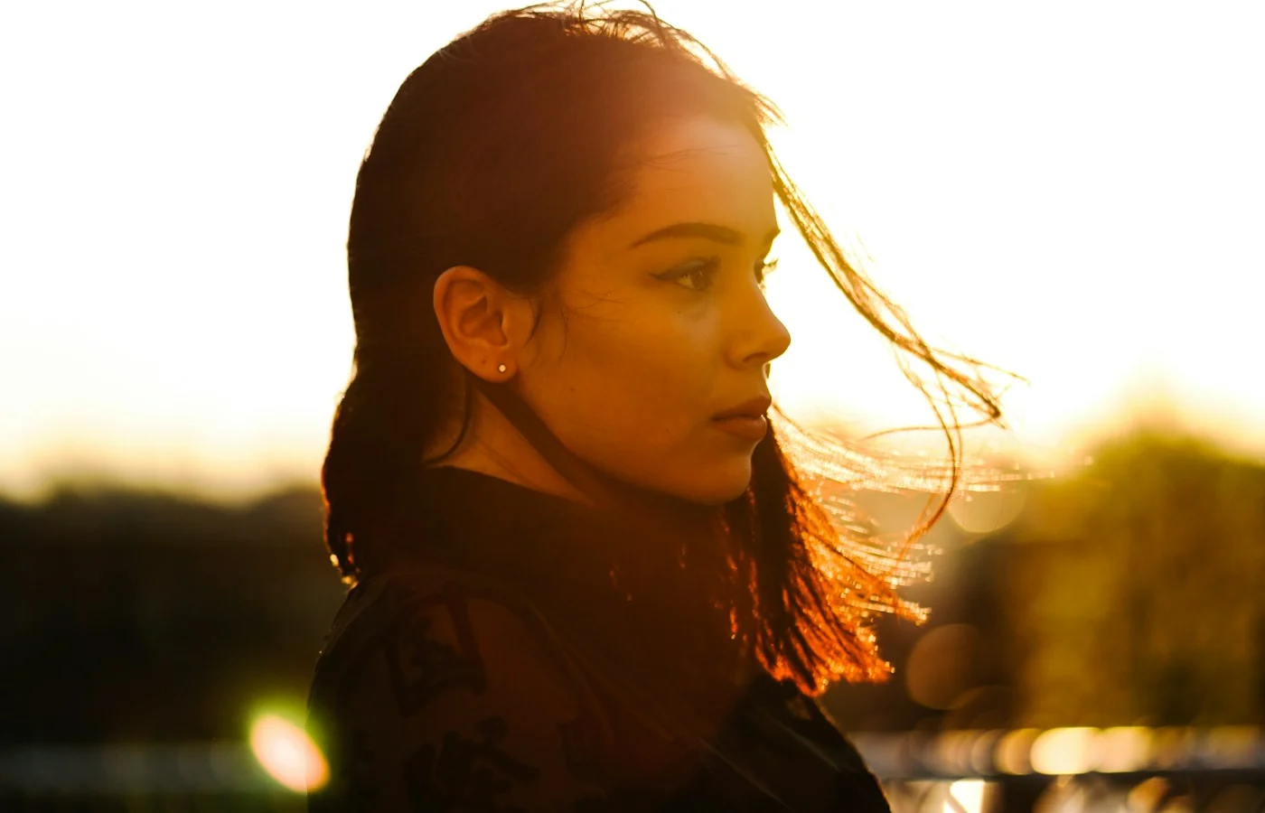
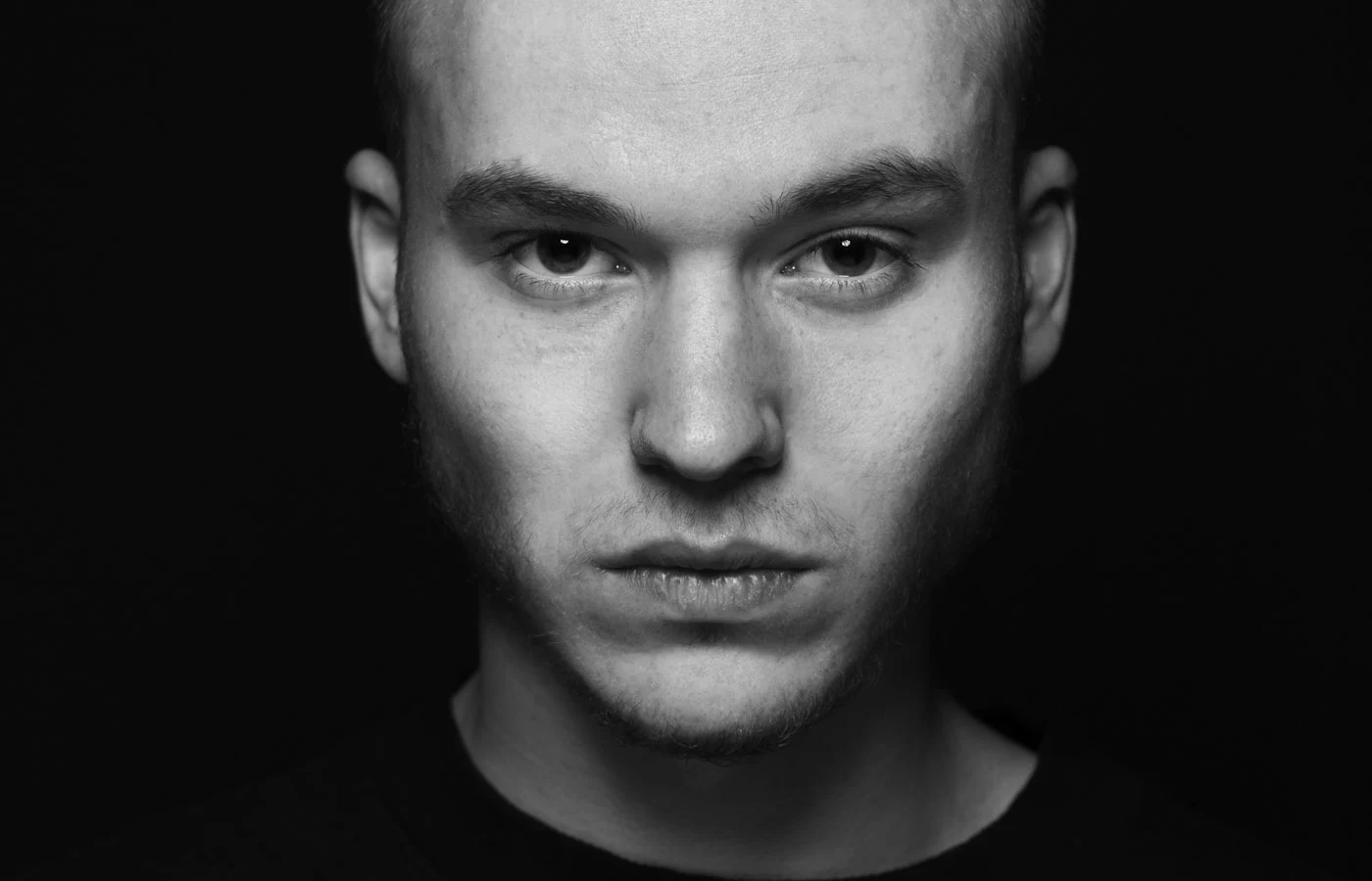
A cinematic portrait looks like a still from a film: contrast, a controlled color palette, and a background that falls away. You can ask an AI image tool for this look by naming four things: the light, the depth of field, the color grade, and the frame. This guide explains each one and ends with a prompt you can adapt.
1. Low-key lighting
Film portraits rely on shadow. Ask for “low-key lighting from one side, with deep shadows on the other”. One strong light with no fill gives the face shape and drama. A thin rim light can separate the subject from a dark background.
Low-key is not the same as dark. The face should still be readable, with the shadow side keeping a little detail.
2. A shallow depth of field
A fast lens keeps the eyes sharp and blurs everything else. Use wording such as “85mm lens at f/1.8, shallow depth of field”. The blurred background also hides small AI errors and makes the subject stand out.
3. A color grade
Grading is what makes an image feel like a movie. Two reliable choices:
- Teal and orange: cool shadows and warm skin tones, the classic blockbuster look.
- Warm amber: a softer, nostalgic mood.
Name one grade only. Asking for several gives muddy color.
4. A wide frame
Cinema uses wide aspect ratios. Finish with “16:9 frame” or “2.39:1 widescreen crop” and leave space on one side of the subject. The empty space gives the image the feel of a movie frame and room for a title.
Choose a look
| Look | Lighting | Grade | Mood |
|---|---|---|---|
| Blockbuster | Low-key side light, rim light | Teal and orange | Tense, high energy |
| Nostalgic drama | Soft window light, gentle shadows | Warm amber, faded blacks | Quiet, reflective |
| Night street | Neon and streetlight glow | Cool blue with warm highlights | Moody, urban |
A prompt to start from
Turn my uploaded photo into a cinematic portrait. Keep my face and features exactly the same. Low-key lighting from the left with deep shadows on the right. Subtle teal and orange color grade, 85mm lens at f/1.8, shallow depth of field, soft film grain. 16:9 frame.
Adjust to taste
- Add “light haze in the background” for atmosphere.
- Swap the grade to “warm amber” for a softer mood.
- Remove the grain if the result looks noisy.
- Ask for “subject on the left third, empty space on the right” to control composition.
Start with the right source photo
The tool can only restyle what it can see. A photo that already has some direction in the light gives a better cinematic result than flat, on-camera flash. Before you upload, check three things:
- The face is clear. Both eyes are visible and sharp, with no heavy glare on glasses.
- The light has a direction. Window light from one side works well. Flat flash removes the shadows that give the image shape.
- The subject has room. A little space around the head and shoulders makes it easier to reframe to a wide crop.
Build the look in stages
A long prompt asking for light, grade, lens, frame, and mood at once is the fastest way to get a muddy image. Build the look in three short runs instead, and keep the version you like at each step.
Run 1, light only. Get the shadows right before anything else.
Using my uploaded photo, keep my face and features exactly the same. Low-key lighting from the left, deep shadows on the right, soft fill so the shadow side keeps some detail. Plain dark background.
Run 2, add the grade. Upload the result of run 1 and add color.
Keep the lighting and my face exactly the same. Add a subtle teal and orange color grade, soft film grain, slightly lifted blacks.
Run 3, set the frame. Finally, change the crop and lens.
Keep everything the same. Recompose as a 16:9 frame with the subject on the left third, 85mm lens look, shallow depth of field, empty space on the right.
Three small steps cost a little more time, but each one is easy to correct. If run 2 shifts the face, you only need to repeat run 2.
Genre variations
The same four parts (light, depth, grade, frame) can be pushed toward different film genres. Change one or two phrases and keep the rest.
| Genre | Phrases to add | What changes |
|---|---|---|
| Film noir | “black and white, hard side light, window blind shadows, high contrast” | Strong graphic shadows, no color |
| Science fiction | “cool blue and cyan light, neon accent from behind, reflective surfaces” | Cold palette with glowing edges |
| Romance | “warm window light, soft focus, gentle haze, muted warm colors” | Soft contrast, flattering skin |
| Thriller | “single overhead light, desaturated colors, dark surroundings” | Tense mood, small pool of light |
For black and white work in particular, the black and white portrait guide explains contrast and tone in more detail.
What to look at before you use the image
- Skin tone. Heavy grades can push skin toward orange or green. Compare it with your original.
- Eyes. Dark lighting can hide the catchlight. A small highlight in each eye keeps the face alive.
- Edges. Check the hair against the background for halos or missing strands.
- The extra space. If you changed the crop, look at the new areas for odd objects or repeated patterns.
If hands, eyes, or teeth look wrong, this fix guide lists the first thing to try for each.
Keep a short prompt log
Cinematic looks are easy to lose by accident. When a result works, save the prompt, the tool, and the source photo name in a note. Next time you can change one phrase and compare, instead of starting again from memory. Results vary between tools and between runs, so a log is the most reliable way to repeat a look.
Common problems and fixes
| Problem | Fix |
|---|---|
| Image is too dark | Ask for “soft fill light so the shadow side keeps detail” |
| Colors look muddy | Name only one color grade |
| Face looks different | Repeat the face instruction and use a sharper source photo |
| Looks like a flat filter | Describe the light direction and add a rim light |
Frequently asked questions
Do I need a widescreen photo to start?
No. You can upload any photo and ask for the wide frame in the prompt. Check the edges of the result for odd details, because the tool has to invent the extra space.
Can I make a vertical cinematic portrait?
Yes. Keep the lighting, lens, and grade, and replace the frame with “vertical 4:5” or “9:16”.
Why does my cinematic portrait look flat even with a grade?
Color alone does not make a frame look cinematic. Contrast comes from the direction of the light and from depth of field. Add a named light direction and a shallow depth of field before changing the grade.
How much grain should I ask for?
Ask for “soft film grain” or “light grain”. Heavy grain can hide detail in the face and make the image look low quality, especially on a phone.
More ready-made options are in the cinematic prompts. To understand each lighting term, see AI portrait lighting terms.